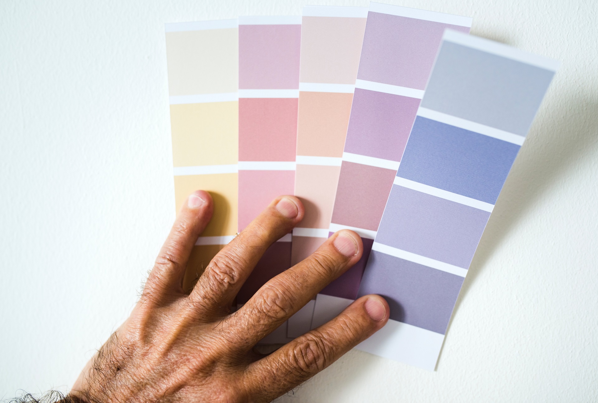
Ever wondered why prescription drugs for children, most syrups especially, are pink in color? Or why the ‘little blue pill’ is blue? Why do most fast-food companies make extensive use of the colors red and yellow? Why do the red walls of the popular fried chicken restaurant make you hungry? There is a single answer to these, and that is ‘color psychology’. Studies have shown that colors have an influence on our psyche—the mood that we are in, the choices we make and so on. The same rules of color psychology are important when choosing the right brand colors for your business because colors can directly influence your customer’s decision to buy or not to buy, and the overall perception they have about your brand.
What are the right brand colors for my business?
There is no single color combination out there that is going to be perfect for your brand. Every brand has its own personality and only by understanding the essence of your brand will you be able to settle on the right one for yours. While we are on the topic of color combinations, remember to limit your selections to a maximum of three colors—two primary colors and one accent color. You want your customers to associate these colors with your brand, not overwhelm them with a riot of colors!
Most often, entrepreneurs end up picking their favorite color and making it their primary brand color. True that it worked for Frank Robinson when he created the iconic red and white logo for Coca-Cola at the turn of the 19th century, but it is advised that you select a color that resonates with your target audience more than it does with you as a person.
How do I select the right colors?
The best way to identify your brand colors is to create a mood board. A mood board is a type of collage consisting of images, words, materials, etc. relating to a particular topic. In this case, select the images that you feel best describes your brand, words that evoke feelings that you associate with your brand, and finally, picture yourself in the shoes of your end customer and pin those images that you think they would relate with your brand.
Once your mood board has substantial content on it, 30-40 items let’s say, use any online tool such as Adobe Color or Color Lovers or Coolors to extract the colors from it. The software will do all the dirty work of pulling the colors and creating different color palettes from your mood board.
The next step is finalizing on a color palette. What is your primary color going to be? This should ideally depend on the nature of the product or service you are selling. For example, a great many banks use various shades of blue as their primary color because universally, people associate blue with trust, intelligence, stability and loyalty. Your secondary color, although different from your primary one, should belong to the same color family. It is here that the rules of color theory come in and help you refine your color palette. The simplest way is to keep the two colors next to each other and ask yourself if they go together or if they clash.
Your third color should be your accent color, the color that will stand out from your brand colors, ideal for grabbing and directing your customer’s attention to important areas such as the Call-to-Action button on your website.
How do I use my brand colors?
While many businesses select their colors right, the majority of them go wrong while putting them to use.The key to attaining perfect contrast is to employ the 60-30-10 principle. Across your website and other marketing paraphernalia, use 60% of your primary color, 30% of your secondary color and 10% of your tertiary, accent color. This would ensure that none of the colors are overused or underused. We don’t want a website awash with your accent color looking like it was birthed at an EDM concert now, do we?
Now that you have a basic idea regarding how to go about selecting your brand colors, know that there are no ground rules per say and you can always experiment to the fullest before settling on what works best for your brand.


